A mobile-first farm management system helping plantation managers track incidents, monitor tasks, and stay on top of operations — all from their phone.
Managing plantations shouldn’t need a manual
Plantation Farm UI is a mobile application designed to simplify farm management for large-scale plantations. The goal was to give farm managers a single, intuitive tool to create incident reports, monitor ongoing issues by priority, and access real-time operational data — without needing technical training.
- Dashboard – At-a-glance KPIs, priority charts, and recent incident feed
- Incident Reports – Structured form to log incidents by state, division, and type
- Notifications – Real-time alerts for new and escalated incidents
- Secure Login – Role-based access with remember me and account recovery
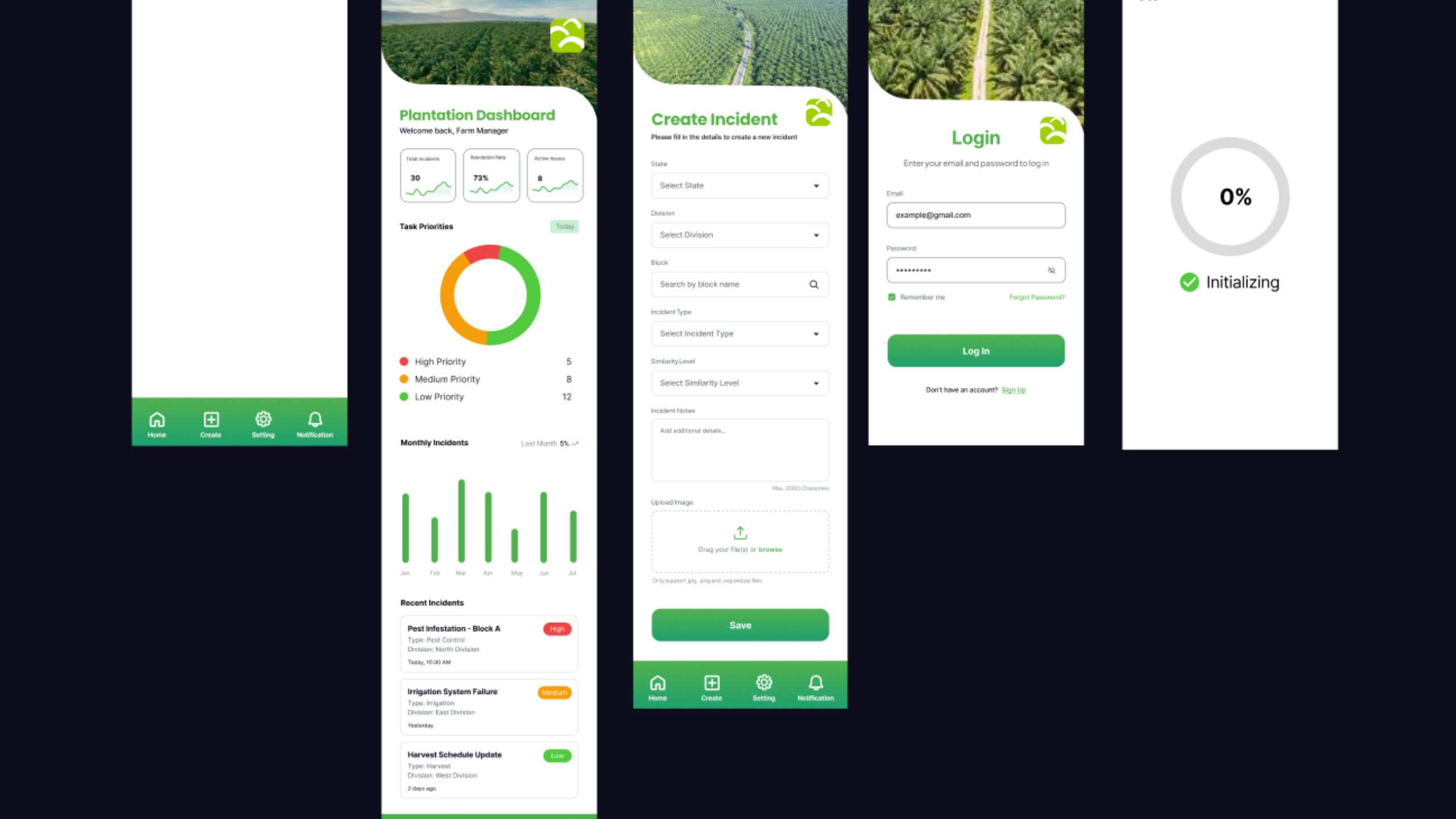
Four core screens, every user journey covered
Home
Overview of total incidents, task priority donut chart, monthly trends, and a live incident feed with severity badges
Create Incident
Structured form with dropdown selectors for state, division, block, incident type, and severity, plus image upload support.
Login Screen
Clean authentication screen with email/password fields, remember me toggle, forgot password link, and sign-up redirect.
Loading
Progress ring splash screen shown on app launch, giving users clear visual feedback while the app initializes.
Intentional choices behind every pixel
The primary green (#1e7a3e) directly mirrors the agricultural context of the product. It builds trust, reinforces brand identity, and makes the app feel at home in a plantation management context rather than like a generic SaaS tool.
High, Medium, and Low priority labels use red, amber, and green respectively — universally understood traffic-light semantics — so managers can triage issues at a glance without reading every row.
A donut chart over a bar chart was chosen for task priorities because the part-to-whole relationship is more important than individual values — managers need to see relative proportion at a glance, not precise counts.
Bottom tab navigation (Home, Create, Settings, Notifications) keeps the four core workflows always accessible with one thumb, reducing cognitive load and eliminating the need to navigate backwards between tasks.
Every screen header uses a real aerial plantation photograph. This isn’t decoration — it contextualises the app, makes managers feel they’re working with their actual land, and builds an emotional connection to the product.
The incident creation form uses dropdowns instead of free-text fields to enforce data consistency. When incidents are filtered or reported later, clean structured data matters far more than free-form flexibility.